Know Why Google goes gaga over responsive web design
T hat’s quite interesting when Google suggests something, right? Yes. The Search Engine Master- Google loves responsive web design over the generic design and the desktop web. And there is an implicit message displayed on the recent mobile search update given by Google regarding the usability of the responsive web design.
Responsive web design brings it all under one roof nevertheless of the size or platform of the device
By 2016, the number of mobile users is going to be remarkably huge and hence the importance of responsive web designs also. Putting it simple, responsive web design makes a website appealing to your eyes in terms of readability, appearance and a lot in search engine optimization.

Source: thinkwithgoogle
How responsive web design works?
The backbone to responsive web design is the CSS- which is the design language which defines the look and formatting of an HTML page. It describes the displaying factors of the elements in a web page such as menu, texts, buttons, images and sidebars etc.
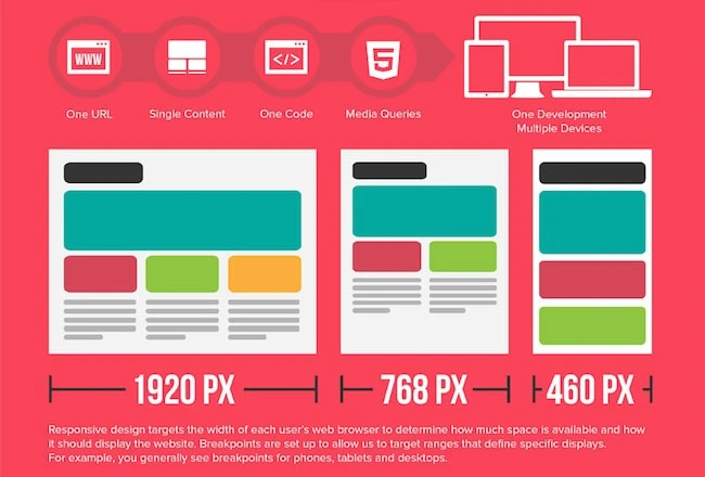
Source: Hubspot
In mobile devices, CSS is composed of media queries which are the key factors that decide the screen resolution and size of the device. By adding the appropriate CSS profile, the websites behaves responsive to each of the requests of the users.
But what does Google has to do with it?
Yes, that is what we need to consider at this moment. Google says that a mobile friendly website can create an influence on the mobile search results on a global level. Explaining it in different way, the pages which are responsive can outrank the websites which is not responsive.
Google recommends webmasters follow the industry best practice of using responsive web design, namely serving the same HTML for all devices and only uses CSS media queries to decide the rendering on each device
Google suggests certain guidelines to make a website mobile friendly such as easy usability, the relevance of themes and texts and how effectively users are able to complete the common tasks etc. The one solution to follow these guidelines is the adoption of responsive web designs and they suggest it there on their instructions.
The one site one URL factor in responsive web design makes it easier for Google to crawl over the pages and to index content. In regular websites designed with dissimilar content to the desktop website, Google considers with high bounce rate in the assumption that there is no relevant content given on the page to the users. But responsive gives the best result here as well.
Is your site responsive?
Better to start late than never. So, you still have time to turn responsive by integrating all the enticing features to your website with high compatibility on their iOS, Android or on all platforms of the desktop. Google gives you hand here also to know how mobile friendly is your website.
Know the mobile friendliness of your website here
Taking help from the search console help of Google, it becomes easier for you to analyze what issues your websites are going through in terms the usability, readability and other related factors on different mobile devices, which your users might be using to browse through your website.
Hence we say- Turn Responsive and Be Responsive…